How Schools Compare to Similar Schools
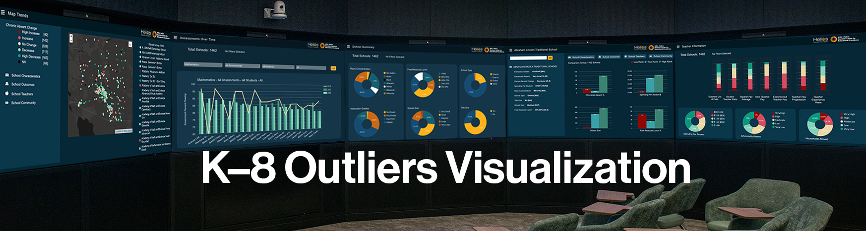
The K-8 Outliers visualization offers a holistic view of Arizona's K–8 education landscape by integrating publicly available data into a user-friendly, interactive platform. Each screen represents a critical dimension of school quality, access, and equity, enabling users to explore trends, make comparisons, and inform decisions. Schools start identifying school (teacher characteristics funding), student (demographics) and community characteristics (e.g., crime, income) that reflect their school. They then see all schools that share that profile and how they compare on student outcomes.
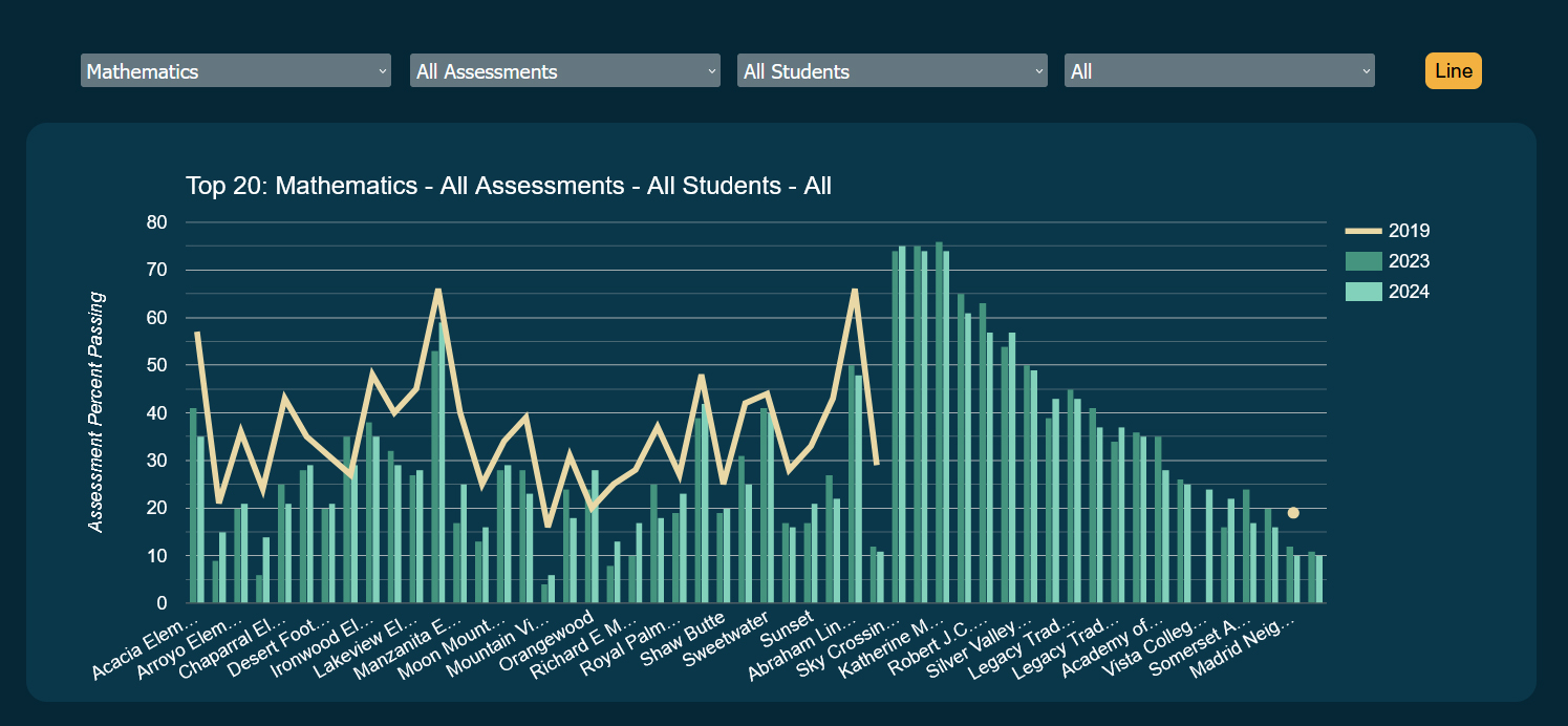
This graph shows the proficiency rates by school pre-pandemic (line) and post pandemic (bars) for all the district’s schools and then for comparable schools.
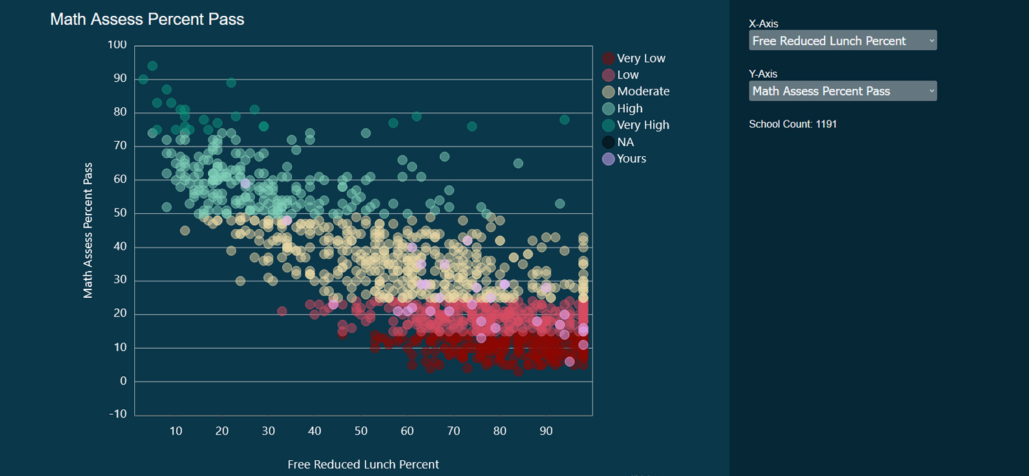
This graph shows proficiency rates, absence rates, change scores and other outcomes for a given year graphed against a characteristic, in this case free and reduced lunch rates. Colors reflect best (green) to worst (red) outcomes.
This tool supports evidence-based decisions, promotes transparency, and enables families and communities to understand educational outcomes. By compiling and visualizing complex data in an easily understood format, the visualization acts as both a mirror and a map: reflecting current realities and guiding future improvement.
We invite you to visit our Decision Theater at Helios campus to explore the K–8 Outliers Visualization. To schedule your visit, please email us at [email protected].
We invite you to visit our Decision Theater at Helios campus to explore the K–8 Outliers Visualization. To schedule your visit, please email us at [email protected].